Brand colors: effect, strategy and practice
Author: Matthias Wimmer · Published: January 28, 2026 · Updated: July 24, 2026
Why brand colors are important in brand identity
Colors are the first thing we notice about a brand. We perceive them before we consciously take in the content.
They shape our first impression and influence whether we find a brand appealing and trust it.
This guide shows small and medium-sized businesses how to strategically select brand colors and implement them correctly from a technical standpoint.
They play a key role in brand recognition. They are not merely decorative embellishments, but a central element in implementing a brand strategy.
In practice, color schemes are often created randomly, aren’t clearly defined, or are chosen purely based on intuition. This leads to discussions within the team as well as uncertainty about how to apply them. In addition, the Brand Identity looks different depending on the channel.
This is exactly where a well-thought-out brand identity comes into play: It provides clarity, guidance, and reliability.
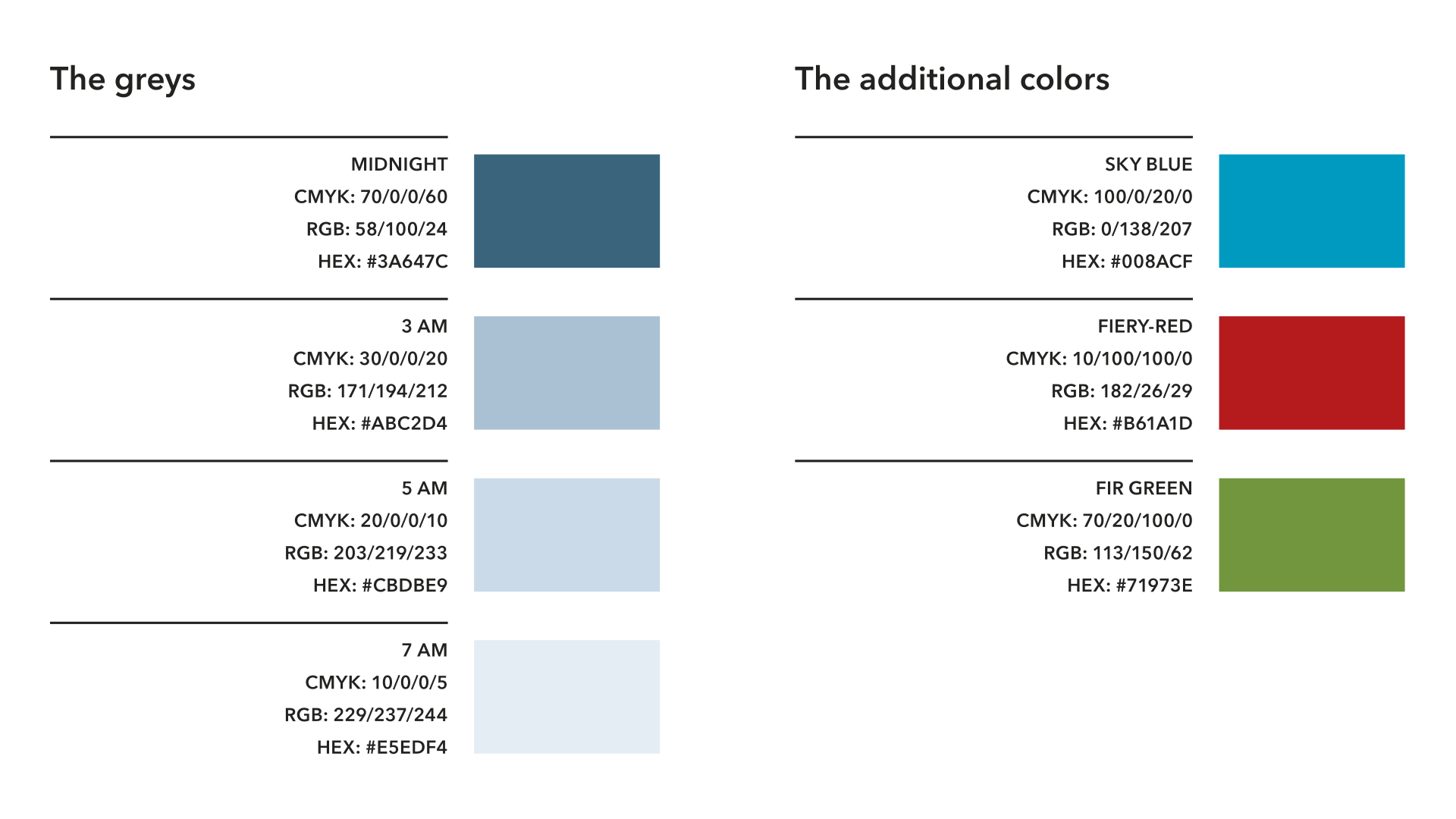
Table of contents

Color selection as a strategy for brand personality
Colors are closely linked to corporate identity and are a central component of brand identity. They convey values, support positioning, and ensure that a brand appears consistent across all touchpoints.
Research shows that colors are a key element of brand communication. They influence perception, brand awareness, and purchasing decisions.
Colors are not merely an aesthetic accessory; they are part of brand management and thus an important factor in building trust and brand recognition.
At the same time, color combinations are a powerful differentiator. In many industries, services, products, and offerings are very similar. A unique color scheme that aligns with the brand makes all the difference. It must be strategically derived and consistently applied.
The key point here is that good color choices can be justified. They are based on the target audience, brand personality, and context of use, not on the favorite colors of individual stakeholders.
Understanding the effects of color: color theory for marketing
Colors trigger associations and influence our perception. This effect is real, but not absolute. Simplistic statements such as “Blue stands for trust” or “Green means sustainability” are too general. In practice, they often lead to wrong decisions.
The context in which a color is used is decisive. Brightness, saturation, combinations with other colors, font selection, typography, and visual language significantly alter the effect. A dark blue can come across as serious and competent or cool and distant. A shade of green can convey naturalness or appear technical and matter-of-fact.

The Impact of color in branding
- Colors influence perception very quickly and often unconsciously.
- The meaning of colors is shaped by culture and specific industries.
- Colors have an effect when combined with other design elements.

Colors and their emotional and cultural meanings
Colors evoke emotions but these emotions are not universal. They are strongly influenced by cultural background, social norms, and market experience. A color may be viewed positively in one cultural context, yet be perceived as neutral or negative in another.
The more international a brand’s presence is, the more important it is to consider the impact of color in a cultural context.
Europe: restraint, quality, differentiation
In many European markets, colors are often associated with the following values:
- Subdued, minimalist color palettes convey professionalism and quality.
- Dark blue and shades of gray stand for competence and stability.
- Subtle accent colors convey control as well as precision.
Depending on the industry and target audience, excessive use of color or high saturation may be perceived as frivolous or unprofessional.
U.S.: clarity, symbolic impact, emotional appeal
In the U.S. market, the use of color is often more bold:
- Stronger contrasts attract attention and create clarity.
- Strong colors stand for energy, optimism and a promise of performance.
- Colors serve as a clear signal rather than a subtle accent.
Brand communication is often more direct, and colors can be used in a more visible and emotional way.
Asia: symbolism, harmony, cultural coding
In many Asian cultural contexts, the symbolic significance of color is more pronounced:
- Colors carry clear cultural meanings.
- Harmony and balance play a major role.
- Mistakes seem out of place more quickly than in Western markets.
This requires particular sensitivity, especially when it comes to colors that define the brand.
The effect of color is always a combination of emotion, culture, and context. Making blanket assumptions about its meaning is unhelpful. The specific context of use remains the decisive factor.
What this means for brand identity
- International brands need flexible yet clearly defined color systems.
- A strong primary color works globally, while accent colors should be adapted locally as needed.
- Color decisions should always be made in consideration of the market, industry, and application.
Systematically developing color harmony in brand identity
An effective color spectrum follows a clear structure. It does not consist of an arbitrary number of shades, but rather of deliberately defined levels:
- Primary color: The brand’s core color with high recognition value
- Secondary colors: Complementary colors used to differentiate between areas, applications, or content
- Accent colors: Colors used strategically to highlight important elements
The more clearly the color hierarchy is defined, the more consistently and efficiently colors can be used in everyday life.
Common mistakes that happen in practice
- Too many accent colors without clear guidelines for their use.
- Lack of distinction between primary and secondary colors.
- No documented color values for different media.
Checklist: Does our color scheme still align with our positioning?
Colors do not have an impact on their own, but rather in conjunction with the brand strategy, the target audience, and the market environment. This checklist helps you assess whether your current color palette still supports your brand positioning.
Answer the following questions:
- Does our color palette clearly reflect our brand’s values and personality?
- Does it support the image we want to project (e.g., competent, approachable, innovative, high-quality)?
- Does our color scheme visibly distinguish us from our direct competitors?
- Do our colors align with our target audience’s expectations?
- Do our colors work equally well for digital and print media?
- Do our website, social media, presentations, and print materials look like they come from a single source?
- Have primary, secondary, and accent colors been defined?
- Are there clear rules regarding which color is used for what?
- Are our colors applied consistently both internally and externally?
If you answer several questions with “No” or “Not sure,” you should strategically review your color scheme.
The optimal color: digital, print, and different requirements
Colors do not function in isolation, but always within a specific context. In everyday life, it quickly becomes apparent that a defined brand color is perceived differently depending on the medium. This is not a flaw in brand identity, but rather a result of varying technical and physical conditions.
What matters is not that colors look exactly the same everywhere. Rather, they should appear consistent across all channels and reliably convey the desired brand message.
Digital applications
Digital media rely on self-illuminating displays. Colors are rendered in the RGB color space and generally appear more intense, vibrant, and high-contrast than in print.
Typical areas of application include:
- Company websites and landing pages
- Social media graphics and ads
- Presentations, slides, and interfaces
In practice, this means:
- Contrast and readability are important, especially for text and calls to action.
- Colors must work well on different devices (desktop, laptop, tablet, smartphone).
- Dark or highly saturated colors can quickly appear overpowering on screens and should be used judiciously.
A clearly defined color system is especially beneficial in the digital space. It makes it easier to maintain a consistent design across many formats and touchpoints.
Print applications
In print, colors are not produced by light, but by ink on a surface. Printed colors therefore generally appear more muted. They depend on factors such as the paper, the printing process, and the print run.
Typical applications include:
- Flyers, brochures, and magazines
- Business stationery
- Trade show and point-of-sale materials
Key practical considerations:
- Paper affects color: Uncoated paper appears warmer and less high-contrast than coated paper.
- Printing methods differ: Offset, digital, and screen printing produce different results.
- Color variations are normal: Minor differences between print runs or materials cannot be technically avoided.
Realistic expectation management is key here: The goal is a cohesive, brand-consistent look and feel. Not an exact match to what’s on the screen.
Typical challenges in everyday life
- Brand colors appear very vivid online but subdued in print
- Social media graphics lose their recognizability due to incorrect contrast
- External service providers interpret colors differently
Best Practice: Always define colors for all media (digital and print) and establish clear guidelines for their use. This will help you avoid discussions, rework, and inconsistent results.
Important: The goal is not an identical look, but a consistent brand image across all channels.
Accessibility: a quality feature for brands
Colors used in brand identity must not only be aesthetically pleasing and consistent with the brand, but also accessible to as many people as possible. Accessibility is not a special case or merely a compliance issue, but rather a key quality characteristic of professional brand management especially in the digital space.
Why accessibility is important when it comes to colors
- A large proportion of people have limited color vision or reduced visual acuity.
- Poor contrast makes it difficult to navigate, read, and interact with digital products.
- Digital products with inadequate color design have been shown to result in higher bounce rates and a lower quality of user experience.
International standards define clear minimum requirements for this. One example is the Web Content Accessibility Guidelines (WCAG) 2.2, which specifically address contrast ratios for text, backgrounds, and interactive elements.
Principles of qccessible color design
- Sufficient contrast between text and background colors
- Do not rely solely on color to convey information (e.g., do not use red as the only way to indicate errors)
- Clear visual states for interactive elements (hover, active, focus)
- Readability over style: especially with small font sizes
Accessibility does not limit design. It generally leads to clearer, more uncluttered, and more functional design solutions.
Accessibility quick check for brand identity colors
(A practical introduction: You can find WCAG contrast requirements explained in an easy-to-understand way here, for example:
W3C: Understanding Contrast (Minimum)
- Are text and key content easily readable even with low contrast?
- Do color contrasts work equally well on desktops, tablets, and smartphones?
- Is information conveyed through shape, text, or icons as well?
- Are buttons, links, and interactive elements clearly recognizable?
- Are contrast requirements included in the brand guidelines?
Best Practice: Accessibility should not be assessed after the fact, but should be taken into account when defining the color palette.
RGB, CMYK, and Pantone: color models explained in simple terms
For colors to work reliably in everyday life, it’s important to understand the fundamental differences between color models. These differences aren’t just design theory. They explain why colors look different on screen than they do in print and why clear rules are needed to address this.
A well-defined brand identity takes all relevant color models into account and establishes clear guidelines for their use.
Additive and subtractive color mixing
Additive color mixing (RGB)
- Used with self-illuminating devices (monitors, smartphones, tablets)
- Colors are created by adding light
- The more light is added, the brighter the result
- Mixing all colors produces white
Subtractive color mixing (CMYK)
- Used in printing
- Colors are created by removing (subtracting) light
- The more ink is applied, the darker the result
- Theoretically, mixing all colors produces black (in practice, supplemented by black/K)
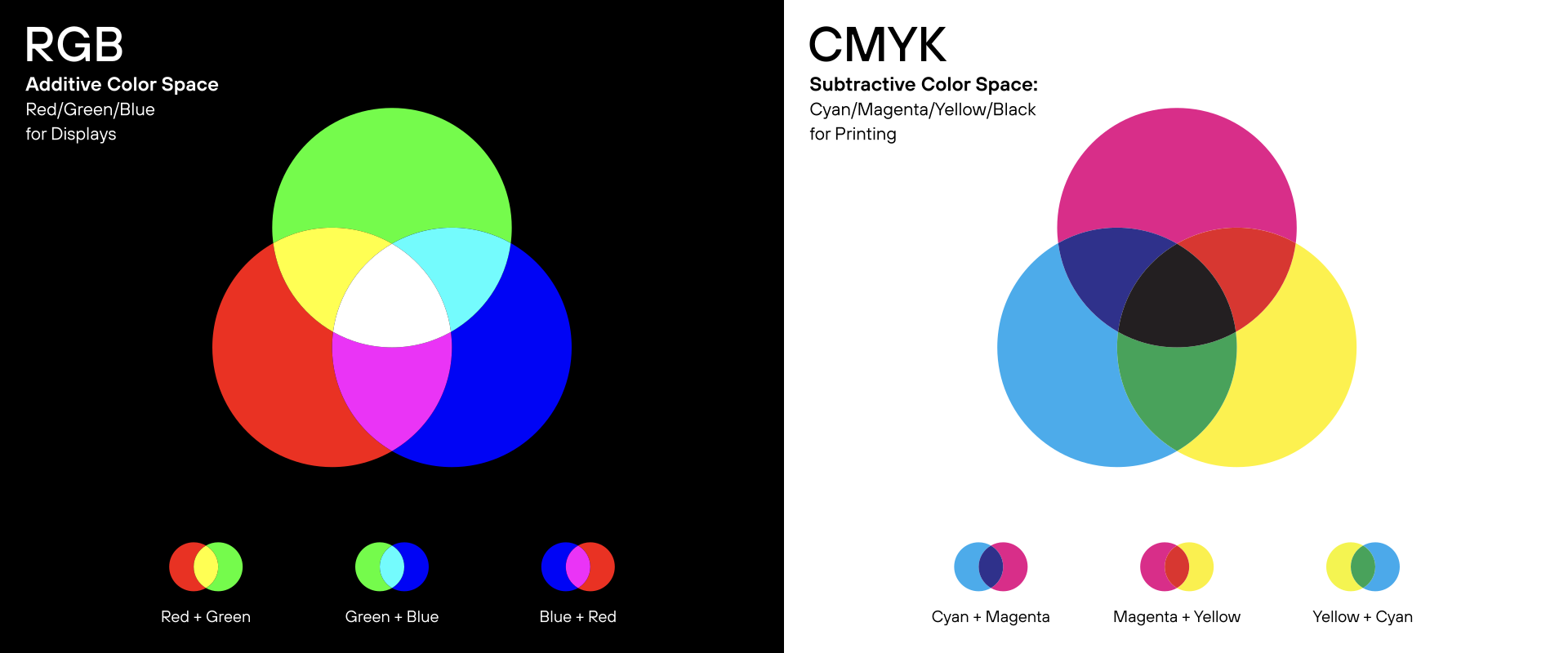
Remember: Screen colors reflect light, print colors absorb it. That’s why colors can never look exactly the same.
RGB: the standard for digital applications
RGB stands for Red, Green, and Blue and is the primary color model for all digital output devices. It enables very vibrant and high-contrast colors that cannot be physically reproduced in print.
Typical applications:
- Websites and Web Applications
- Social Media and Online Campaigns
- Presentations and Digital Interfaces
Practical note: RGB colors should be used exclusively for digital media. If they are transferred to print without being checked, color discrepancies will inevitably occur.
CMYK: the reality of printing
CMYK stands for Cyan, Magenta, Yellow, and Black. This color model forms the basis for traditional four-color printing.
Key Features:
- Smaller color gamut than RGB
- Depends on the paper, printing process, and machine
- Colors often appear duller compared to the screen
Practical note: A professional brand identity defines fixed CMYK values to ensure that print results are predictable and reproducible.
HEX Colors: a practical approach for web & UI
HEX colors are not a separate color system, but rather a technical notation for RGB colors. They are primarily used in web and UI contexts to uniquely define colors.
A HEX color value consists of six characters that describe the proportions of red, green, and blue (e.g., #1F3A5F). For developers, CMS systems, and web tools, HEX is the most commonly used color value.
Typical applications for HEX colors:
- CSS and Web Development
- Content Management Systems
- Page Builders and Marketing Tools
- UI Components and Design Systems
Important to note: HEX does not replace RGB; rather, it complements it. A professional brand identity defines RGB and HEX values for digital applications. This ensures an easy and lossless transition from design to implementation.
RGB describes the color, HEX ensures that it is rendered correctly on the web.
Pantone: precise brand colors for print
Pantone is not an alternative color model, but a standardized spot color system. Pantone colors are printed as pre-mixed colors and are not mixed from CMYK.
When Pantone is useful:
- When a brand color needs to be reproduced with exceptional precision
- For high-quality printing applications
- For large print runs or sensitive materials
When Pantone is usually not necessary:
- For purely digital applications
- For standard print products without high color requirements
Important: In practice, Pantone is a printing issue. Digital representations of Pantone colors are always only approximations.
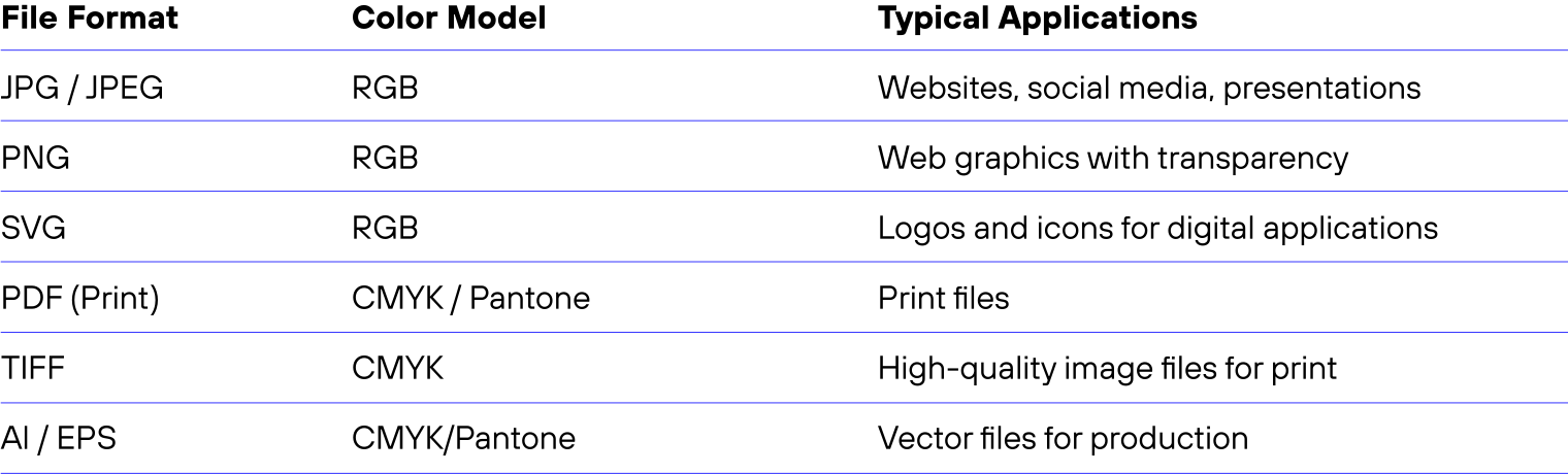
File formats and color models
Common mistakes in real-world practice
In our day-to-day work with brands, certain problems crop up time and again, regardless of industry or company size:
- Colors have evolved over time but have never been strategically reviewed
- Only RGB values exist; there are no clear definitions for print
- Accent colors are overused and lose their impact
- External service providers interpret colors differently
- Color guidelines are either undocumented or difficult to understand
These mistakes rarely lead to a single major problem. Instead, they cause many small inefficiencies in day-to-day operations ranging from unnecessary correction cycles to inconsistent brand messaging.
Brand color as part of brand identity guidelines
Without clear rules, colors are inevitably used inconsistently in everyday life. brand identity guidelines provide clarity in this regard.
Our overview, “The Components of Brand Identity,” shows how color fits into a complete brand identity alongside the logo, typography, and other elements.
Well-defined color definitions include:
- Color values for RGB, HEX, CMYK, and Pantone (if applicable)
- Clear guidelines for each medium
- Guidance on contrast, readability, and accessibility
Infobox: benefits of clear guidelines:
- Fewer follow-up questions and rounds of revisions
- Greater consistency across all channels
- More efficient collaboration with internal and external teams
When does a color refresh make sense?
A color refresh doesn’t necessarily mean a complete break from the existing visual identity. Often, it’s about refining existing colors, giving them more structure, or updating them to reflect current trends.
A color refresh is particularly useful when:
- the positioning or target audience has changed
- new digital channels have been added
- the website appears inconsistent
- colors have reached their technical or functional limits
- accessibility has not been a consideration so far
If two or more of these points apply, it’s worth conducting a structured review of your color scheme.

Color Selection in 5 Steps: A Practical Framework
Here’s how color decisions are made in a systematic and transparent way:
1. Clarify positioning
What values, attitude, and tone should the brand convey?
2. Analyze the target audience and context
In what context is the brand perceived and with what expectations?
3. Develop a strategic color scheme
Definition of primary, secondary, and accent colors with a clear hierarchy.
4. Test the application
Testing colors in real-world scenarios (web, print, presentations, social media).
5. Document the rules
Defining color values, usage rules, and contrasts in the guidelines.
Frequently asked questions qbout colors in brand identity
What colors are suitable for a brand identity?
There are no universally “right” or “wrong” colors. The appropriate colors depend on positioning, the target audience, the market environment, and the intended use. What matters most is that colors are chosen for strategic reasons, used consistently, and support the desired brand impact.
How many colors should a brand identity have?
In practice, a clearly structured color palette works well when it includes:
– a primary color as a visual anchor
– a few secondary colors for differentiation
– one or two accent colors for highlighting
Too many colors without a clear hierarchy quickly lead to visual clutter and inconsistency.
RGB, HEX, or CMYK: Which color values are really necessary?
A professional brand identity typically requires several color values:
– RGB and HEX for all digital applications
– CMYK for traditional printing
– Pantone (optional) for brand-critical print applications
The more clearly these values are defined, the more smoothly their implementation will proceed across various media.
Why do brand colors look different in print than they do on screen?
Screen colors are based on light (additive color mixing), while print colors are based on ink and material (subtractive color mixing). Different papers, printing processes, and devices inevitably lead to variations. The goal, therefore, is not exact replication, but a consistent brand image.
When should a color scheme be revised?
A redesign is advisable if the positioning, target audience, or channels have changed. Other reasons include an inconsistent brand image or technical and functional requirements that are no longer being met (e.g., accessibility).
Is accessibility in brand identity a requirement or an option?
Accessibility is not an optional extra, but a hallmark of modern brand management especially in the digital space. Good contrast and clear color guidelines improve readability, user-friendliness, and trust for all users.
Sources & further reading
The following sources provide a technical context and support the key points made in this article. They are deliberately not from design agencies, but rather from research, standardization, and independent institutions.
Color effects & perception
- Elliot, A. J. & Maier, M. A. (2014): Color Psychology: Effects of Perceiving Color on Psychological Functioning in Humans – Annual Review of Psychology (DOI)
→ Grundlagenforschung zur emotionalen und kognitiven Wirkung von Farben - Labrecque, L. I. & Milne, G. R. (2012): Exciting Red and Competent Blue: The Importance of Color in Marketing – Journal of the Academy of Marketing Science (Springer)
→ Relevanz von Farbe für Markenwahrnehmung und Positionierung
Culture & color
- Aslam, M. M. (2006): Are You Selling the Right Colour? A Cross-cultural Review of Colour as a Marketing Cue – Journal of Marketing Communications (DOI)
→ Unterschiede in der Farbwirkung zwischen Kulturkreisen
Color models & technical fundamentals
- International Color Consortium (ICC): Farbraum- und Farbmanagement-Standards (color.org)
→ Technische Grundlage für konsistente Farbdarstellung über Medien hinweg - ISO 12647: Prozessstandards für den Offsetdruck (ISO 12647-2)
→ Referenz für reproduzierbare Druckfarben
Accessibility & contrast
- W3C – Web Content Accessibility Guidelines (WCAG 2.2) (W3C)
→ Internationale Referenz für barrierefreie Farb- und Kontrastgestaltung im Web
Note: Source references are provided for technical context and guidance. In practice, the specific brand, target audience, and application context are always decisive.
Conclusion: Colors help build brand awareness
Colors are not merely a decorative detail, but a central element of brand management. They influence perception, trust, and recognition and thus the success of a brand identity.
A systematic, well-documented approach to color helps make decisions more objective. It also speeds up processes and ensures brand consistency.
Our introductory article, “What Is Brand Identity?,” explains what brand identity is all about and why it’s important for your brand.
Your contact for brand identity

Please contact your brand identity specialist!
More insights on this topic:

Brand development: How does a strong brand emerge?
Why some companies make an immediate impression and others don’t.
More on brand development

What is brand identity?
Definition and significance for your brand.
Learn more about brand identity here.

What are the benefits of brand identity?
Brand identity is an investment in your company’s financial success.
Here you can learn more about the benefits of brand identity.

How much does brand identity cost?
How much does it cost and what factors influence the cost?
Here you can learn more about the costs of brand identity.

The brand identity process
How is a branding developed, and who is involved in the process?
Learn more about the brand identity process here.

Briefing for brand identity projects
Are you planning a brand identity project but aren’t sure exactly how to get started?
Take advantage of our brand identity briefing.