Legibility: What makes a typeface easy to read?
Author: Matthias Wimmer · Published: May 11, 2023 · Updated: November 2, 2025
The design of a font plays a special role in readability.
Well-designed type takes several factors into account at once: letterforms, contrast, line spacing, and context.
This article explains the basics of readability from typeface design to its use in brand identity and on websites and highlights what really matters when choosing a typeface.
Readability is a key criterion for good design. After all, even the most beautiful layout is of little use if the content cannot be clearly understood.
Especially in the context of professional brand identity, typography is more than just a design element; it contributes significantly to brand identity.

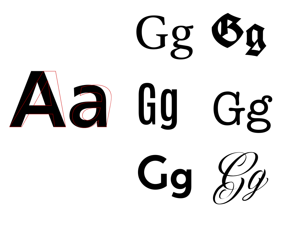
Choosing a highly legible font is not just a matter of aesthetics; it also has a major impact on how effectively content is conveyed and understood. It plays an important role in the usability, accessibility, comprehension, and overall success of any written communication.
Fonts for brand identity
In addition to purely functional criteria, choosing the right font is a key factor in the success of your communication. Type conveys far more than words alone and is therefore a tool for creating a lasting and effective brand identity.
To ensure that typography is used consistently across all media, fonts, typefaces, and usage guidelines should be documented in a brand design guide.
Fonts for web design
Choosing a highly legible font is also important in web design. It improves usability and supports accessibility. A suitable, highly legible font contributes to a website’s overall success by appealing to visitors and effectively conveying your brand’s message.
Our article, “Website Typography in Detail,” shows how good typography is implemented specifically on websites.
Two factors that influence the readability of a text
The readability of a text depends on font selection and typography. These two factors are closely related, but they represent different aspects of how fonts are used in design and layout to optimize readability.
Font selection
Font selection refers to choosing a specific typeface for a particular text. This involves decisions about the basic design of the letters, such as whether to use a serif or sans-serif font, the letterforms themselves, and other stylistic considerations.
Use of the font
Typography encompasses the art and technique of arranging and formatting text to make written language easy to read and visually appealing. This also includes the correct use of different typefaces in a layout.
Your contact for type and typography

How letter design affects readability
Letter proportions
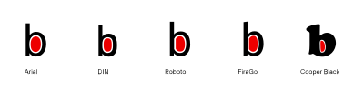
The relative width of the letters should be neither too narrow nor too wide. For optimal readability in the “regular” typeface, the width of the inner surface (n) should be 40%–60% of the x-height (x).
Variations in character width
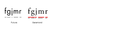
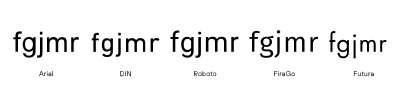
Fonts such as Futura have significant variations in the width of individual letterforms. This limits the readability of the narrower letters. Fonts such as Adobe Garamond have smaller variations in the width of individual letterforms, which improves readability.
Contrast in line widths
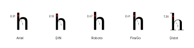
The contrast in a letterform is determined by the ratio of thicker to thinner strokes within the letter. The contrast should not be too great. The ratio between the thickest and thinnest stroke widths should be between 3:1 and 1.5:1.
Line strength
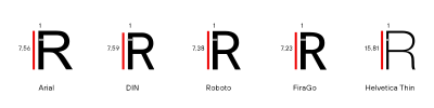
For good readability, the ratio of the relative thickness of the stroke to the height of the capital letter should be less than 1:10. The smaller the font size, the larger this ratio should be.
Internal forms
The relationship between line weight and white space should be balanced. Combining a thick line weight with little internal white space makes the text harder to read. A large internal shape combined with a thin line weight also makes the text harder to read.
Opening the letter shapes
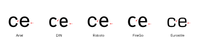
The white space (gaps) that results from open letterforms, such as “n,” “C,” “S,” or the lower part of “e”, should not be too small, so that the interior of the letter does not appear closed. This makes the text harder to read, especially for readers with visual impairments. Conversely, larger open white spaces emphasize the individuality of the letterform and thus improve readability.
x-height
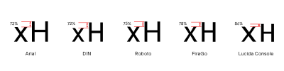
The difference in height between uppercase and lowercase letters has a significant impact on readability. Fonts with large x-heights typically appear larger than fonts with smaller x-heights. This ratio has a particularly significant impact on readability at smaller font sizes.
The x-height (the height of the lowercase letter x) should be between 67% and 75% of the x-height. Some readers with dyslexia, however, find fonts with larger ascenders and descenders easier to read.
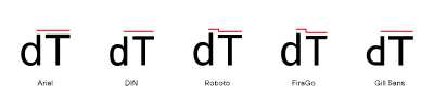
The ascenders of lowercase letters that extend beyond the capital height also improve the recognizability of individual letterforms and, consequently, the legibility of the typeface.
Similar letter shapes
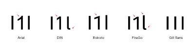
Fonts that use very similar letterforms for different letters are harder to read. For example, “l, L, 1, i” can easily be confused if they do not have distinct shapes, such as through the use of serifs.
Mirroring
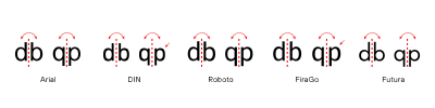
Fonts that use mirrored letterforms such as “db” or “pq” are harder to read, especially for readers with dyslexia.
Letter shapes that are difficult to distinguish
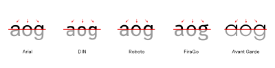
Fonts with very similar letterforms for example, highly geometric fonts such as ITC Avant Garde Gothic, with its “a,” “o,” and “g”, make reading more difficult. At first glance, the basic shape of all three letters appears to be a circle. More distinctive letterforms, such as those of Fiera, are, by contrast, easier to distinguish and therefore easier to read.
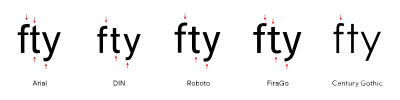
Likewise, a distinct “tail” on the smears makes them easier to identify.
Good readability through the proper use of typefaces
Fonts should be used strategically. For example, using highly legible fonts allows users and readers to grasp content better and more quickly. In addition, good typography supports accessibility and minimizes barriers.
The following criteria play a role here:
- Font size
- Character width
- Line spacing
- Line length
- Alignment
- Formatting






Criteria for selecting an appropriate font
- Easy to read both online and offline.
- In line with the brand.
- Distinctive in appearance.
- Solid enough for all purposes.
- Affordable for all applications.
The power of habit
People get used to certain fonts and then find them the most readable. However, that doesn’t mean that the most commonly used fonts, such as Helvetica, Arial, Times, and Verdana, are also the most readable. Clients’ preferences are a factor that must be taken into account in order to find a truly readable font for a project.
Good readability and accessibility
In general, the same requirements that apply to a highly legible typeface also apply to accessible or low-barrier typefaces. Good legibility therefore automatically ensures low barriers.

More insights on this topic:

Briefing for brand identity projects
Are you planning a brand identity project but aren’t sure exactly how to get started?
Take advantage of our brand identity briefing.

What is brand identity?
Definition and significance for your brand.
Learn more about brand identity here.

Web typography: How to design highly readable websites
Web typography determines how quickly visitors can grasp content, how professional a website appears, and whether information remains easy to read on all devices.
Learn more about web typography

The brand identity process
How is a branding developed, and who is involved in the process?
Learn more about the brand identity process here.