Web typography: type for legible websites
Author: Matthias Wimmer · Published: July 17, 2026
Good typography is much more than a matter of taste. It determines how quickly visitors can grasp the content, how professional the web design appears, and whether information remains easy to read on all devices.
When it comes to smartphones and tablets in particular, the requirements are different from those in print. Carefully planning font sizes, line spacing, and contrast not only improves readability but also increases the user experience and accessibility.
Why typography is so important on the web
Users read differently on the Internet than they do in print media. Text is often skimmed, viewed on small screens, or read under poor lighting conditions.
Well-designed web typography helps to
- grasp information more quickly,
- direct attention effectively,
- increase dwell time,
- reduce the bounce rate, and
- build trust in the company.
Even small adjustments can make a big difference.

Choosing the right font for websites
Not every font is equally suitable for the screen.
Good web fonts are characterized by clear letterforms, adequate character spacing, and good rendering at various sizes.
We explain the basic criteria for highly legible typefaces, regardless of the medium, in detail in our guide to type and readability.
Suitable options include, for example:
- Inter
- Source Sans 3
- Open Sans
- Roboto
- Lato
- IBM Plex Sans
What matters most is not the specific typeface itself, but its readability across different devices.
The optimal font size
Text that is too small remains one of the most common problems on corporate websites.
The following guidelines can serve as a reference:
- Body text: 16–18 px
- Introduction: 18–22 px
- H2: 28–36 px
- H3: 22–28 px
These values may vary slightly depending on the font.
Line length and line spacing
Long lines of text make reading considerably more difficult. Conversely, lines that are too short interrupt the flow of reading.
The following guidelines have proven effective:
- approximately 60–75 characters per line
- line spacing between 1.4 and 1.7
- sufficient spacing between paragraphs
This makes it easier for readers to move from one line to the next.
Responsive typography
A font size that looks comfortable on a large monitor may already be too small on a smartphone.
That’s why typography should be designed to be responsive.
These include, among other things:
- flexible font sizes
- relative units such as rem
- adjusted line spacing
- optimized headings for small displays
Modern CSS functions such as clamp() allow for resizing without the need for numerous media queries.
Typography and accessibility
Readability is an essential component of accessible websites.
Key elements of accessible typography:
- sufficient color contrast
- sufficiently large font size
- clear fonts
- sufficient line spacing
- avoiding the exclusive use of color to convey information
- good keyboard accessibility
This benefits not only people with disabilities, but all users.

Useful tool: WCAG Color Contrast Checker
The Color Contrast Checker can be used to determine the contrast of color combinations and verify their compliance with WCAG.
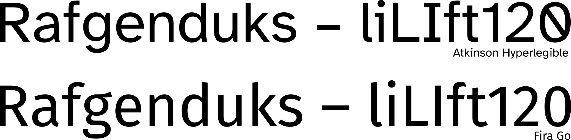
Examples of (accessible) fonts with maximum readability
Atkinson Hyperlegible
Atkinson Hyperlegible is a typeface specifically designed for maximum readability, particularly for people with visual impairments. It was designed by the Braille Institute and released free of charge.
FiraGo
FiraGo is a further development of Fira Sans. As a font with an extensive glyph set and support for a wide range of language systems, FiraGo is one of the strongest open-source fonts with high readability. However, it is not a specialized accessibility font like Atkinson Hyperlegible; rather, it strikes a balanced compromise between aesthetics and readability.
Learn more about how highly readable fonts are designed here.
Typography in brand identity
A company’s corporate font shapes the recognizability of its branding. At the same time, it must function reliably on the web.
When making a selection, you should therefore consider the following:
- Good display on all devices
- Sufficient font styles
- Web font availability
- Load time
- Licensing model
Not every print font is automatically suitable for websites.
Your contact for typefaces and typography

Typographical errors on websites
These errors are particularly common:
- font size that’s too small
- insufficient contrast
- justified text without hyphenation
- lines of text that are too long
- too many different fonts
- overloaded headings
- insufficient white space
- purely decorative fonts in body text
Even just a few of these issues can significantly impair readability.
Checklist for good web typography
Before publishing a website, it’s worth doing a quick quality check:
- Is the body text easy to read?
- Does the typography work well on smartphones?
- Are the headings clearly structured?
- Are the contrast and line spacing appropriate?
- Are no more than two typeface families used?
- Is all text designed to be accessible?
Conclusion
Good web typography improves readability, improves usability, and supports brand perception.
By taking font sizes, spacing, contrast, and responsive design into account from the very beginning, you lay the foundation for a website that appeals to both visitors and search engines.
Frequently asked questions about website typography
What font size should a website use?
For body text, 16 to 18 pixels has become a standard starting point. Depending on the font and target audience, a larger font size may be appropriate. It is important that text is just as easy to read on smartphones as it is on large screens.
Which fonts are particularly well-suited for websites?
Clear sans-serif fonts such as Inter, Source Sans 3, Roboto, or Open Sans often offer excellent readability on digital devices. However, it is not just the font itself that matters, but also the font size, line spacing, and contrast.
Are serif fonts unsuitable for the web?
Not necessarily. Modern serif fonts can also work exceptionally well on screens. They are particularly well-suited for brands with a classic or high-end look. It’s important that the font remains easy to read at small sizes.
How many fonts should a website use?
In most cases, one or two typeface families are sufficient. Using one typeface for headings and another for body text creates a clean and consistent look. Too many different typefaces can quickly make the layout look cluttered.
Why is responsive typography important?
Users access websites using a wide variety of devices. Responsive typography ensures that font sizes, line lengths, and spacing adapt flexibly to different screen sizes, keeping content easy to read on any device.
What role does typography play in SEO?
Typography is not a direct ranking factor. However, it does influence the user experience: Content that is easy to read is absorbed more easily, and visitors often stay on the page longer and interact with the content more frequently. This can have an indirect positive effect on a website’s performance.
Which WCAG requirements are particularly relevant to typography?
Key factors include sufficient color contrast, a font size that is easy to read, scalable text, adequate line and paragraph spacing, and a clear heading structure. These measures improve accessibility for all users.
More insights on web design:

How much does a website cost?
How much does it cost to have a website professionally designed? What are the components of the cost?
Learn more about the factors that influence the price of a website.

Briefing for web design projects
Are you planning a new website and not sure where to start? Our website briefing will help you answer the basic questions.
Take advantage of our web design briefing.

Website concept
Are you wondering how to organize your website’s content and structure in a logical way? We’ll explain how to go about it in a clear and practical way.
7 steps to a web concept