Logo redesign and new website for Stiftung Pfennigparade
Project duration: January 2019 – present
The task: a modern look and feel and an accessible website for the Munich-based foundation
The Pfennigparade Foundation needed to modernize its brand identity and digital presence. MWIMMERDESIGN developed a new logo and an accessible website to present the diverse range of services offered by this Munich-based inclusive foundation in a contemporary way.
The results are impressive. Together with the client, MWIMMERDESIGN is developing a new website and logo for the Pfennigparade Foundation.
Our Services:
Learn more about the two projects here
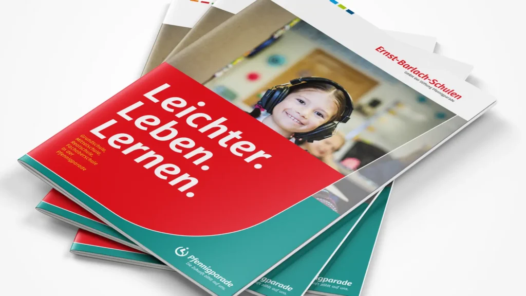
Redesign: The new Pfennigparade logo. Ready for the “digital” future.
Client: Pfennigparade Foundation, Munich, a nonprofit foundation with over 2,000 employees
Task: Redesign the Pfennigparade logo; develop an accessible website with a contemporary look for the foundation and the services offered by its subsidiaries.
Services: Consulting, workshops, strategy development, concept development, logo design, UX, web design, implementation in WordPress
Initial situation: topic and task
The current Pfennigparade logo is outdated and has some technical shortcomings. It needs to be modernized, especially with regard to digital applications.
Strategy: the path to the goal
Since Pfennigparade supports people with physical disabilities and other impairments throughout all stages of life, one requirement was to retain the tried-and-true “Pfennigparade wheelchair” for the logo. The logo and word mark were therefore optimized very carefully.
Solution/implementation
A new, accessible typeface was chosen for the word mark, which is also being used as the new corporate typeface. The logo’s design was made more open and dynamic and adapted to the requirements of digital display formats.
Getting to the new Pfennigparade logo
Analysis of the existing logo
In the run-up to the redesign, a thorough analysis of the existing logo was conducted. The logotype and signet were evaluated for their strengths and weaknesses.

The signet
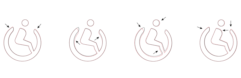
The “cut” along the top edge is very sharp (1) and appears somewhat impersonal.
The stroke weights vary little and lack dynamism; overall, they are very heavy (2).
The curves and transitions in the shape are not uniform and are not optimally designed (3).
The logotype
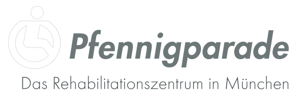
The existing logo uses the “Futura Bold Italic” font. The typeface is and appears very structured, static, and technical. The chosen shade of gray seems somewhat lackluster and lacks contrast.
The “Futura Light” font used for the tagline also appears very contrived, static, and technical. Especially when displayed in small sizes (particularly on a screen), its fine lines make it difficult to read.
Conclusion
The Pfennigparade’s current logo is outdated and no longer aligns with the organization’s newly defined set of values. From a design perspective, there are also numerous opportunities for improvement.
Optimization of the signet
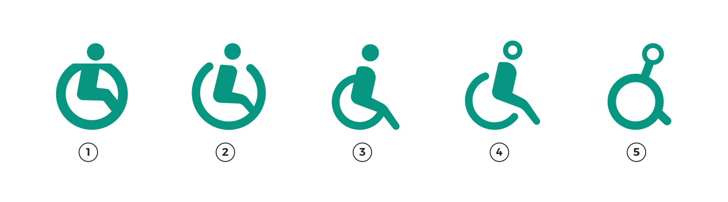
Based on the desired level of abstraction (2), the next step was to optimize the logo’s design. The goal was to achieve a more human, dynamic look and a more open design that would make the logo more recognizable.
Through an intensive design process, line weights, dynamics, proportions, openness, and the depiction of the “wheelchair user” were continuously optimized, and the design was repeatedly tested for impact and functionality.
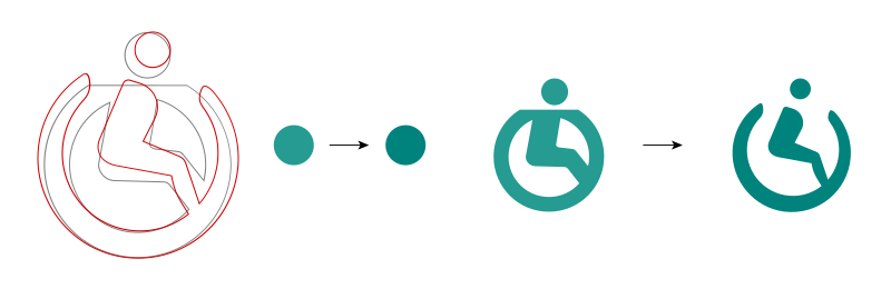
The color scheme of the emblem has also been redesigned. The new shade is more vibrant and leans more toward “green” and less toward “petrol.” As a result, it appears bold, confident, and more approachable, and it complements the newly defined shade of the logo font better.
The new logotype
The logotype (Futura Heavy Oblique) was too rigid and contrived, and its overall effect was rather austere and impersonal. A new typeface that was as accessible and legible as possible had to be found.
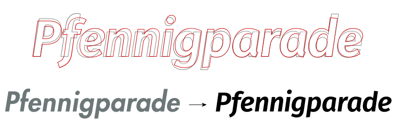
The “FiraGo semibold italic” font is now used for the logotype. The new font complies with accessibility guidelines, features a more dynamic and varied design, and thus no longer appears static or contrived. Pure black is now used for the color to provide clear contrast and improve readability.
The result: a new, modern, and accessible logo
The new logo appears more open, more human, and more dynamic. The design is harmonious, and the curves are dynamic and lively. The logotype complies with accessibility guidelines and also features a more dynamic and varied design language. It no longer appears statically constructed or rigid. The pure black provides clear contrast and improved readability.
The redesign process at a glance:
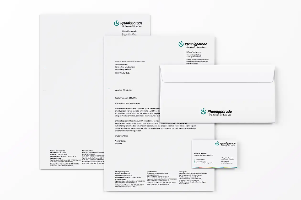
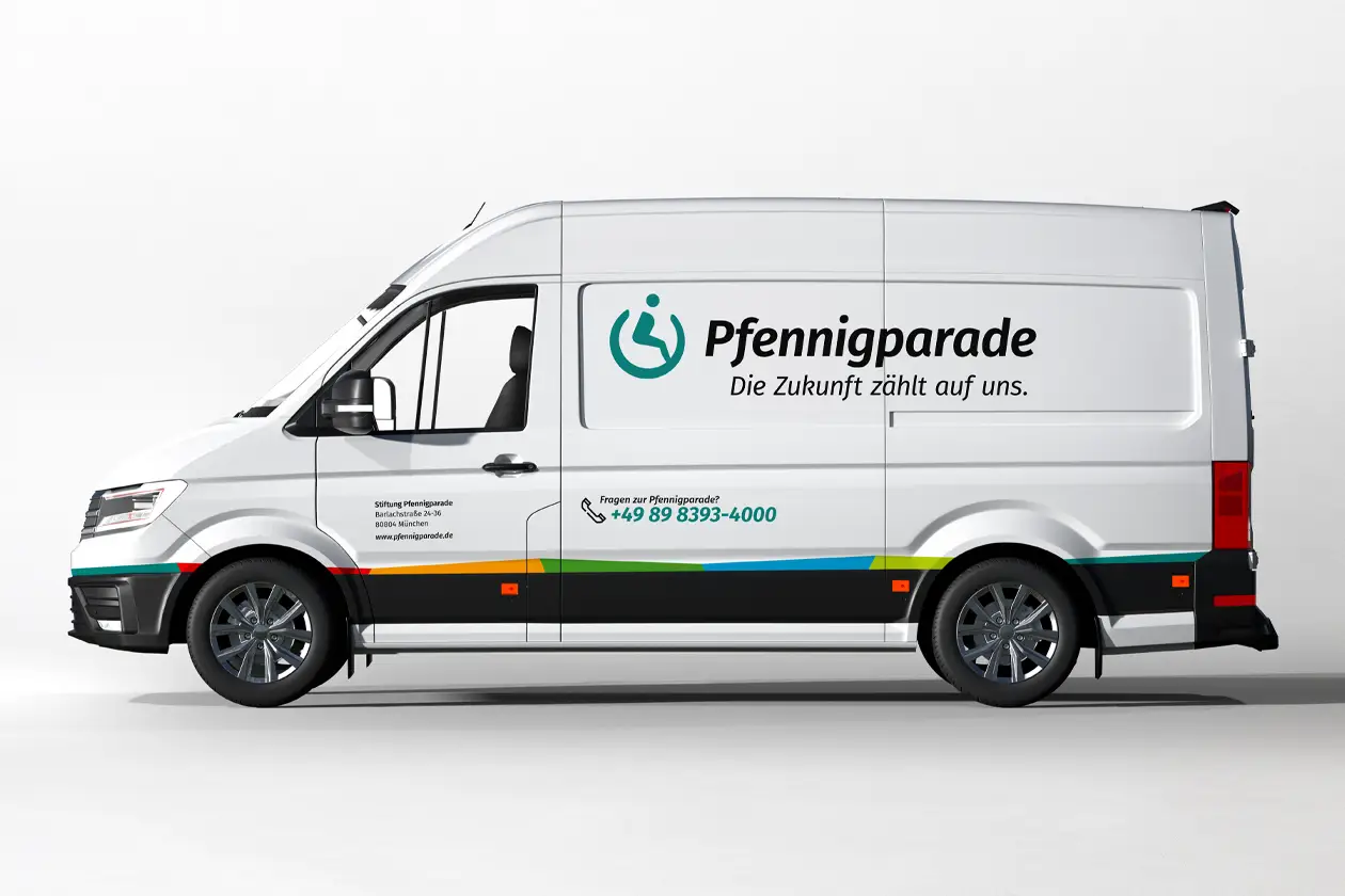
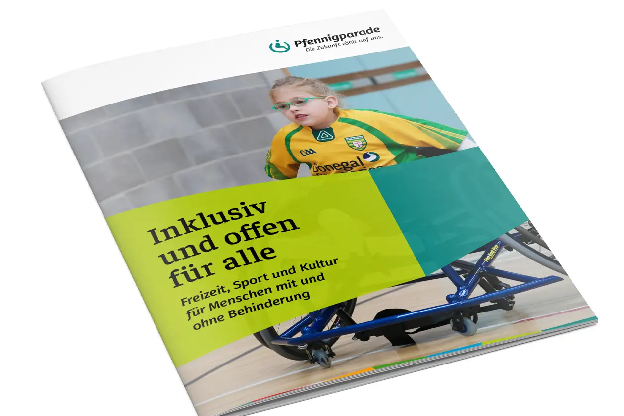
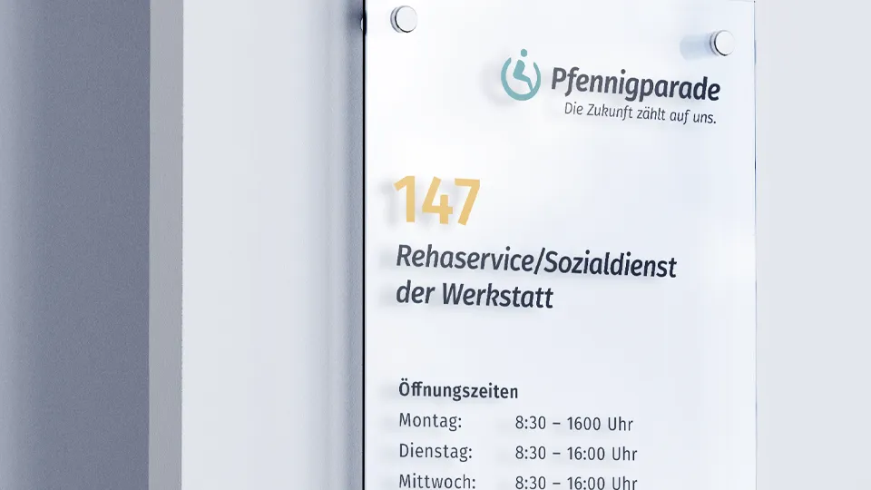
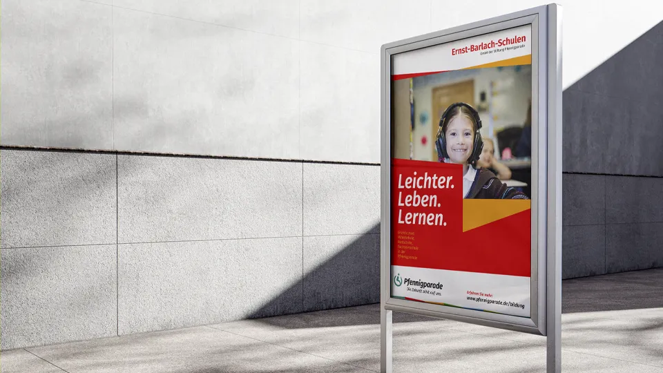
The new Pfennigparade logo in action
Website redesign: Pfennigparade Foundation
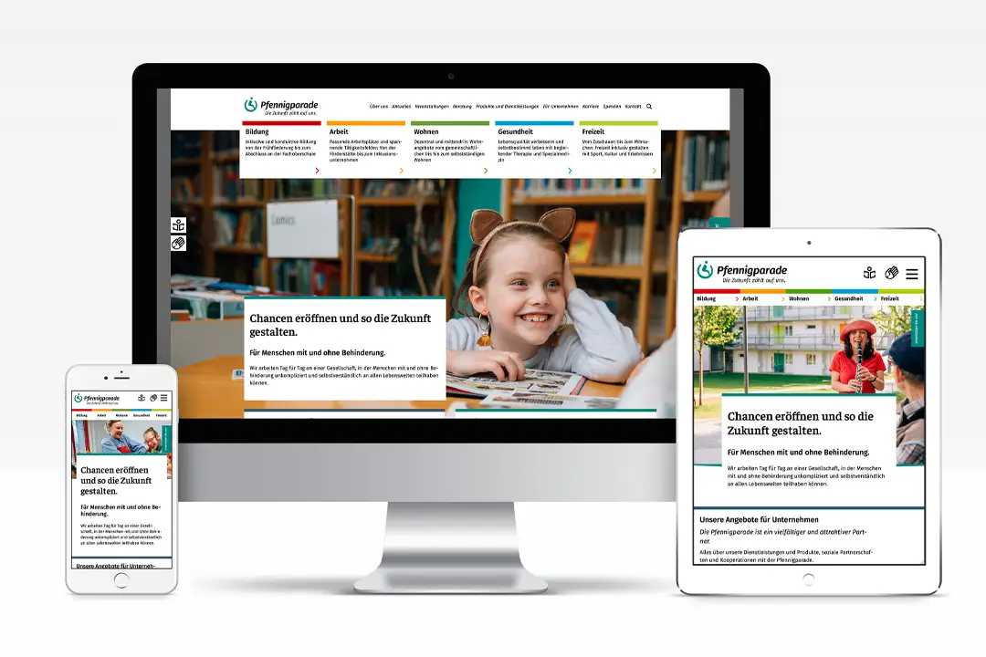
A website designed for accessibility that clearly presents the wide range of services offered by the foundation and its subsidiaries.
Initial situation: topic and task
The existing website for Pfennigparade with its more than 60-year history, 80 facilities and services, and 2,500 employees was no longer able to adequately shows the offerings of the foundation and its 16 subsidiaries. Over the years, the site had expanded in all directions and had become difficult to navigate. Some parts of the offerings were not displayed at all, while others were presented in an outdated manner.
Overall, the presentation was heavily influenced by Pfennigparade’s internal perspective and was difficult for users to understand. In addition to conceptual and content-related issues, the site also had technical shortcomings, such as a lack of responsiveness, outdated links, etc. The most urgent task was therefore to reorganize Pfennigparade’s offerings in a structured and understandable way as the basis for the website relaunch.
Strategy: the path to the goal
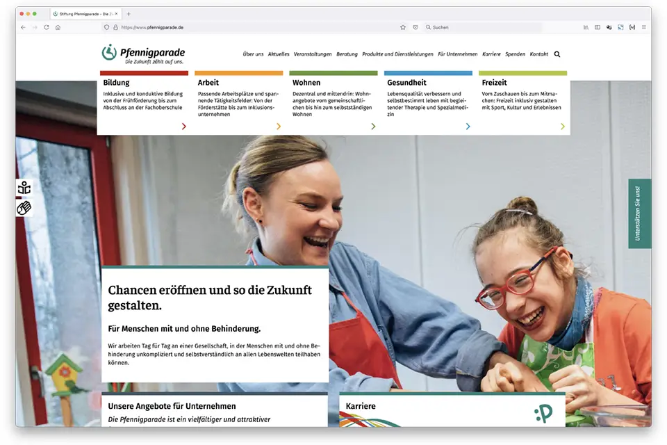
Through numerous interviews, we gathered information on the content and requirements of the individual limited liability companies (GmbHs) and services, as well as those of the foundation as the parent company. To translate this extensive content into a clear website structure, the offerings were divided into the life domains of “Education, Work, Housing, Health, and Leisure,” and the content was assigned to the respective life domains.
The result is a structure that is user-focused and relatively easy to navigate. This structure served as the basis for developing the corresponding page types and templates that make up the site.
Solution/implementation
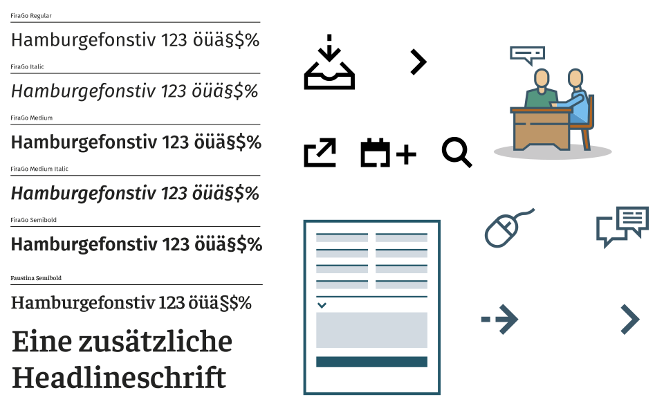
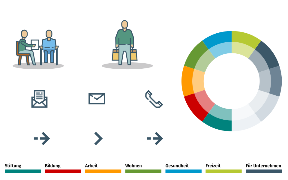
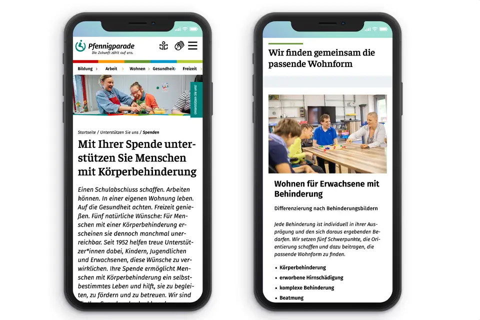
In designing the page types, accessibility was a key consideration alongside clarity and loading speed. As a result, an accessible web font (FiraGo) was used, a color-coding system for the different living environments was introduced, and, of course, care was taken to ensure that the coding complied with accessibility standards. The navigation is based on the principle of progressively more detailed information units (e.g., Education: Schools, Inclusive Secondary School).
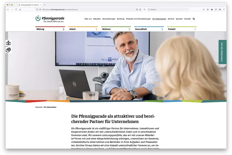
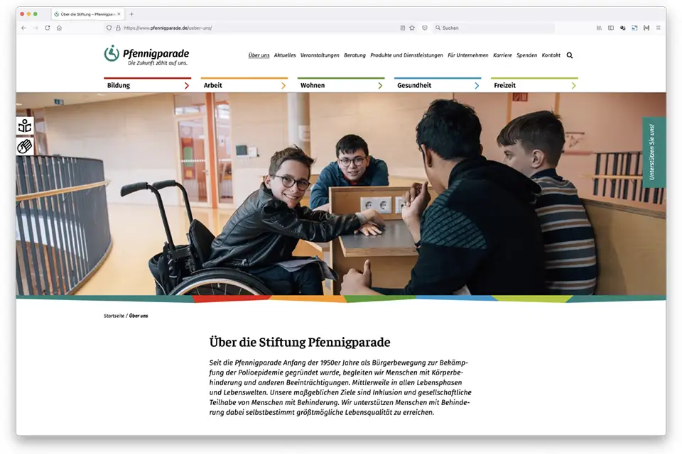
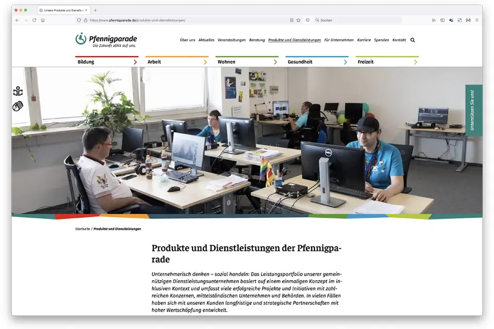
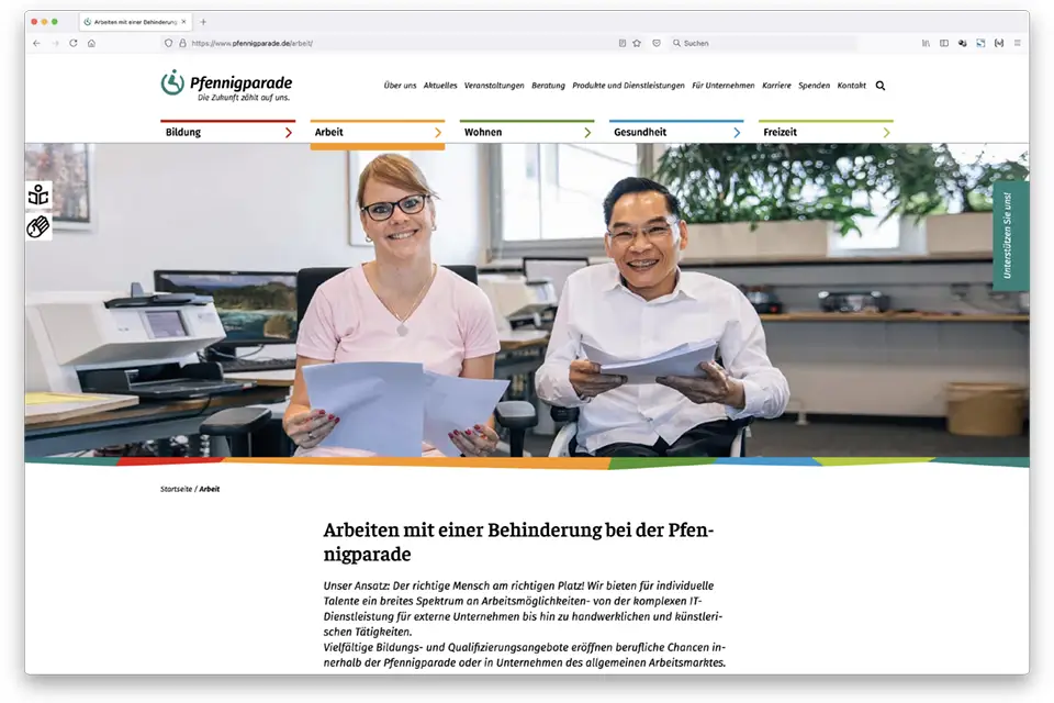
All images featured on the website are authentic, meaning they show “real” staff members and rehabilitation clients on the premises of Pfennigparade. This visual style along with the color-coding and the individual design elements and illustrations defines the overall look of the new website. The site was built using WordPress.
Our services as Web Design Agentur
Graphic elements, icons and symbols for the Pfennigparade website









Web design: Pfennigparade website

Your contact person
Matthias Wimmer
Are you ready for a free initial consultation to get to know each other and discuss your current questions?